After a few months of effort (and even more months idly thinking about it), I finally released Tempy, my latest app.
Tempy is a quick notes app. A digital scrap of paper that is always handy. And it’s an app that I’ve been wanting for myself for a long time.
The brief
- An experienced focused on quick capture
- An editor that makes both writing and reading enjoyable
- Easy ways to get text out of the app
Quick capture done right(tm)
At first glance, a quick capture app is just a text field that you an get to quickly. And while there is much more to it than that, it should always feel that simple to the user. So any advanced feature must be yield to this simplicity.
So let’s start with the basics: Tempy runs in the background (you can even hide the Dock icon if you’d like) and you can open a blank note from anywhere with the shortcut ⌥⌘+N. It opens the window, cursor blinking. Anything you type is saved immediately. When you’re done writing, just hit escape or close the window.
But always opening a blank note can get annoying quickly. I often find myself amending notes in quick succession. Some apps address this with a timer (e.g. only create a new note after 30 seconds and instead open the previous note before that), but that always felt like a bandaid to me.
Instead, Tempy opts for a combination of solutions:
- A second global keyboard shortcut that always opens the most recent note (
⌥⌘+M) - Quick navigation through notes using either keyboard shortcuts or toolbar buttons
- A note picker that lets you find and open any note with a few keystrokes (and also gives you a nice preview)
As you can see, Tempy is heavily nudging you towards being used with the keyboard. While the app is fully mouse-accessible, using it with the keyboard is much faster.
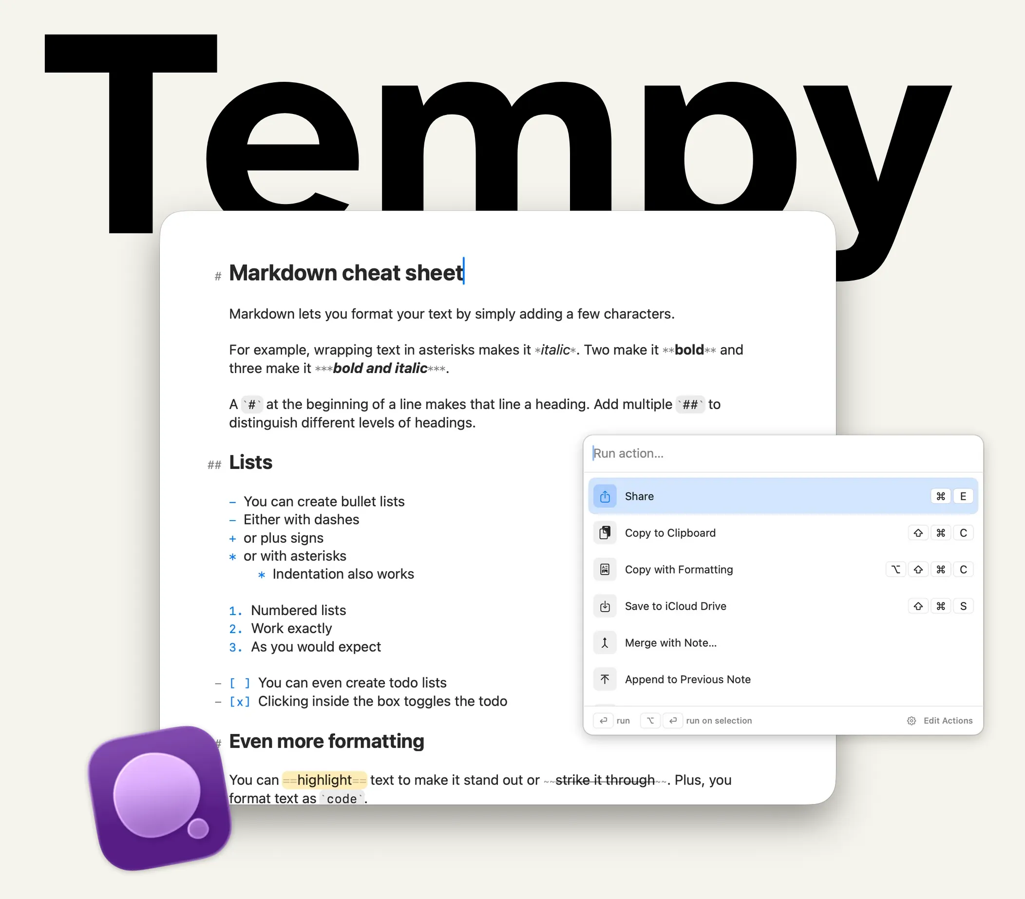
The Editor
I have a love-hate relationship with markdown. I love how it keeps me flow while writing, but I hate that it makes text look really messy. Some editors solve this by hiding markdown characters, but that creates a different problem, because it means that text jumps around whenever the cursor happens to touch a formatted element.
So the challenge for Tempy has been to create an editor that looks pretty while feeling stable. That meant obsessing vor little details like the exact scaling factor of certain characters or creatively mixing different fonts for the best overall effect. While there are still many things I’d like to improve, I’m really happy with the result that shipped.
Actions: your text is going places
So we have a great editor that you can get to quickly from anywhere. But now that you have written something down, you might want to do something with it. Since Tempy explicitly doesn’t want to be a place where you keep a ton of notes stored for a long time, it comes with Actions that help you move text outside of the app.
At the most basic level, actions can do things like copy text to the clipboard or use the system share function to send it to another app. But they also know a few other tricks. Most importantly, they can open URLs and run Apple Shortcuts. With those two capabilities alone, Tempy can be integrated with almost any other app.
Send text as a message, save it to your favorite second brain, bounce it over to an AI. No two workflows are exactly the same, so it was important to me that this part was flexible and customizable.
Aren’t there other apps like this?
Yes. Most certainly. And I’ve been using many of them.
The one that is probably the most well-know is Drafts, the OG quick capture app. It’s a great piece of software and I have been a paying subscriber for many years. However, it always felt like a compromise. It is extremely powerful, but that also made it feel inaccessible to me. The editor also isn’t particularly nice to look at, in my opinion. Drafts is a workshop for text at this point, but I wanted a quick capture tool.
Other apps have different limitations. The bottom line is that I couldn’t find one that did what I wanted it to do: Capture text quickly from anywhere, look and feel good, and otherwise get out of the way.
What’s next?
I’m using Tempy every day now. I write notes, messages and AI prompts in it. It’s where my meeting notes first go, as well as my journal entries. So I very much see myself as Tempy’s first customer. That alone gives me enough fuel to keep developing it.
I hope you’ll also give Tempy a try. It’s a free download for Mac. The only feature currently behind a paywall are custom actions, so you’ll get most of the value for free.
If you do, please tell me what you think. How do you use it? How would you ideally like to use it?
Big shout out to my friends who have been test-driving Tempy for the last couple of weeks.